Bob Boone, who passed away last week, would have turned 79 years old today. His professional playing career spanned four decades, beginning with the 1969 Raleigh-Durham Phillies and ending with the 1990 Kansas City Royals. The Baseball Traveler newsletter tips its cap to a true baseball lifer. Let's talk about Minor League Baseball. |
DID YOU SEE THAT? THESE MINOR LEAGUE LOGOS ARE MORE THAN MEETS THE EYE |
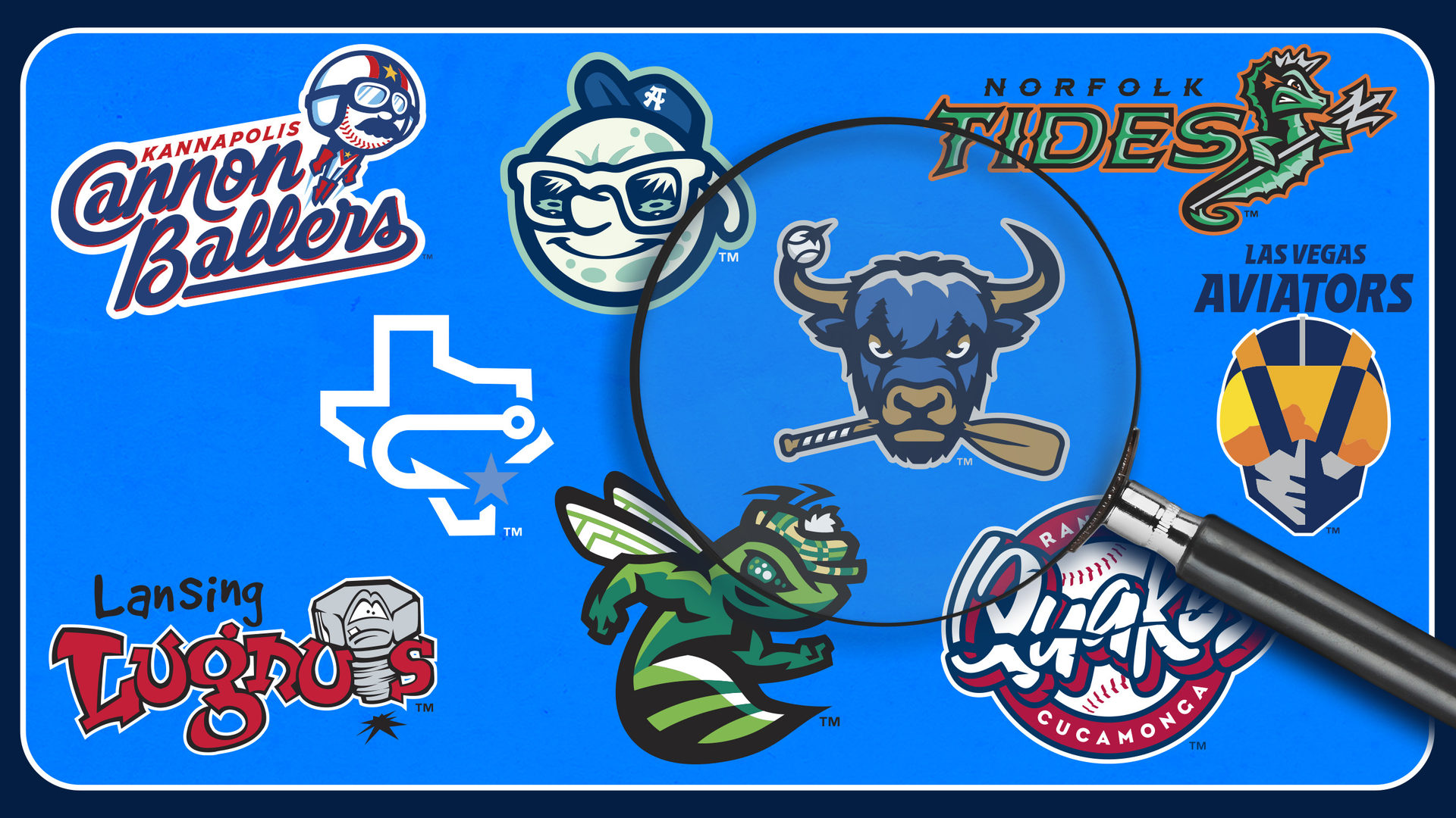
A good logo needs to "pop," offering a clear and colorful visual that grabs attention and cultivates fandom. That's not to say, however, that there can't be subtlety as well. Amid the bombast, many Minor League logos include understated, or downright hidden, elements that you may not have noticed before. Let's take a closer look, via the following (far from comprehensive) roundup of Minor League logos that are more than meets the eye. |
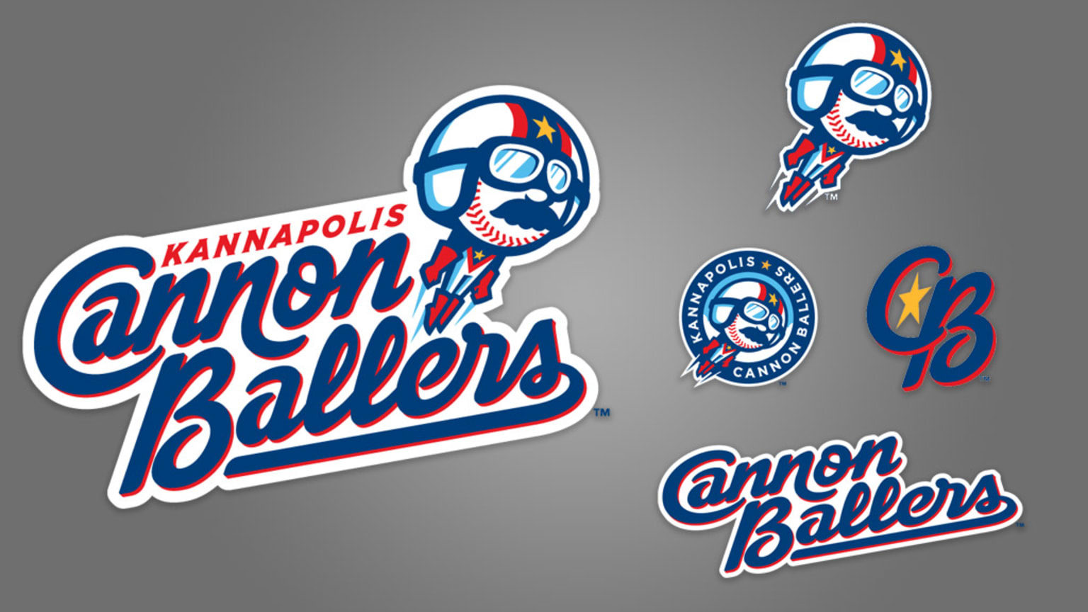
Kannapolis Cannon Ballers (Single-A CWS)
Before assuming the Cannon Ballers moniker following the 2019 season, Kannapolis' team was known as the Intimidators. This was an homage to racing legend Dale "The Intimidator" Earnhardt, a Kannapolis native who died in a crash at the Daytona 500 two months prior to the Intimidators' on-field debut in 2001. The Cannon Ballers still reference "The Intimidator," via the mustachioed, tracksuit-wearing stuntman featured in the primary logo. The "B" in the Cannon Ballers' script contains the number 3, also a tribute to Earnhardt. |
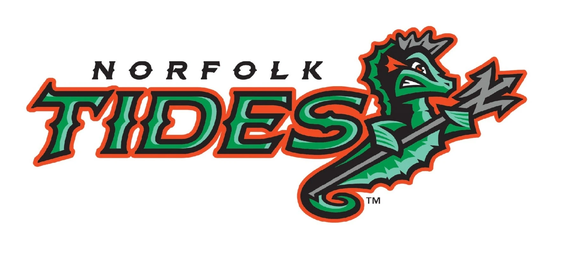
Norfolk Tides (Triple-A BAL)
When the Tides unveiled new logos prior to the 2016 season, they noted that they were the first team to utilize a sea green, jade and orange color scheme and that they were also the first team to include a seahorse as part of a primary logo. Those trying to make sense of this heretofore unknown logo reality might have missed something: The seahorse is brandishing a trident, the business end of which resembles the letter N. That’s N for Norfolk, of course, but perhaps the trident had previously belonged to Neptune, god of the sea. |
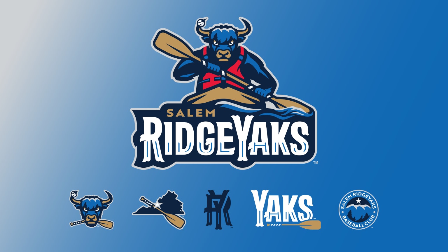
Salem RidgeYaks (Single-A BOS)
You've probably never examined the top of a yak’s head for hidden meanings, but there’s a first time for everything. The titular domesticated bovine species depicted in Salem's primary logo has a head that resembles a Blue Ridge mountain landscape, with its furrowed brow creating the tree line. The blue etchings within the RidgeYaks wordmark refer to the blazes painted on trees along the Appalachian Trail. |
|
|
|
Augusta GreenJackets (Single-A ATL)
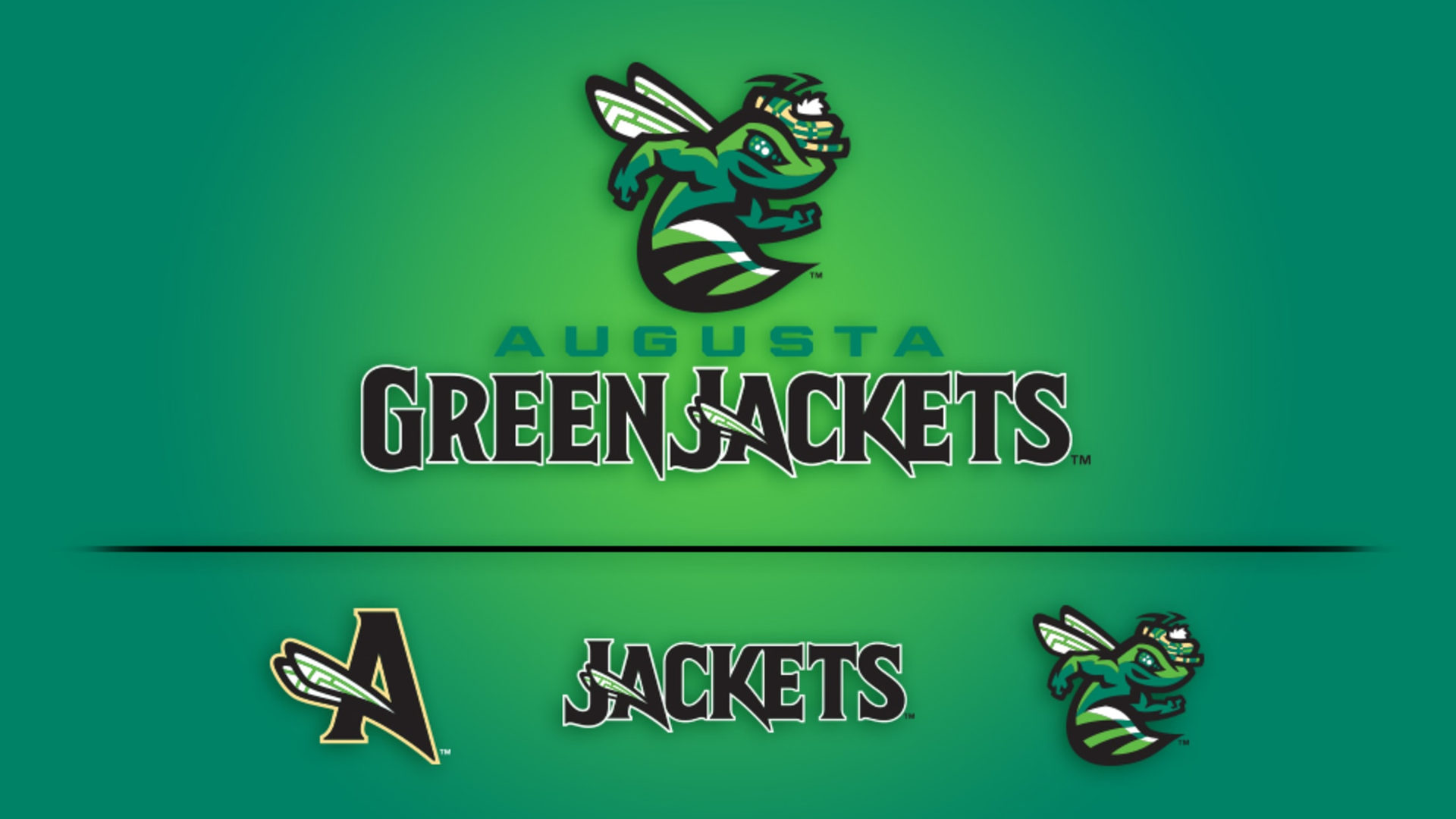
You probably know that the GreenJackets are named for the esteemed apparel worn by winners of the Masters Tournament held at Augusta's National Golf Club. The GreenJacket bee featured in the team's logo is depicted wearing a plaid duffer's cap, but that's not the only nod to the sport for which Augusta is most renowned. Check out the bee's dimpled eye, which resembles a golf ball. "It definitely was a labor of love leading up to it, a few late nights this week to make sure we had all the details right," said Megan Angstadt, VP of community and fan engagement. "But absolutely worth it to be a small part of those families' lives." |
Rancho Cucamonga Quakes (Single-A LAA)
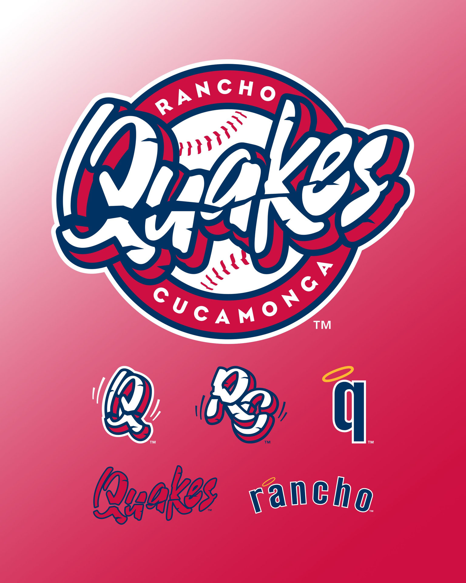
If you didn't realize the significance of the jagged line that runs through the Quakes' wordmark, it's not your fault. It's Rancho Cucamonga's. This logo quirk represents the fault line that puts the city firmly in (earth)quake territory. The fault line also appears on the brim of the home cap. |
|
|
|
Corpus Christi Hooks (Double-A HOU)
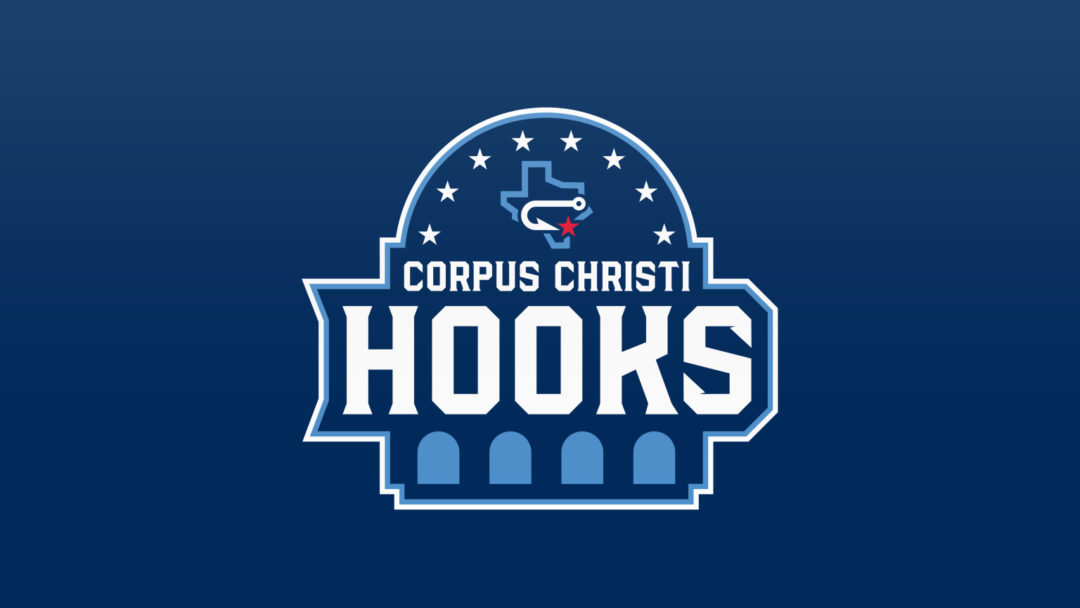
The Hooks' name is a celebration of Corpus Christi's bayside location and the plentiful fishing found therein. The team's primary logo, unveiled prior to the 2025 campaign, features a hook looping across the state of Texas, with its end pointing to a red star that denotes Corpus Christi's location in the state. The eight stars above refer to the city's eight miradors, gazebo-like structures situated along the bayfront. The shape of the primary logo itself resembles a mirador. |
Asheville Tourists (High-A Astros)
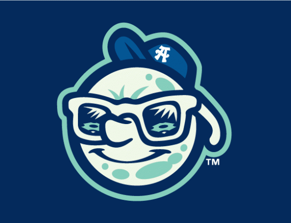
Mr. Moon, a key component of the Ashville Tourists' identity since 2010, nods to the fact that Asheville's team was originally known as the Moonshiners. Mr. Moon wears sunglasses, which feature the reflection of the Tourists' playing field as well as the mountainous terrain that surrounds it. |
Las Vegas Aviators (Triple-A A's)
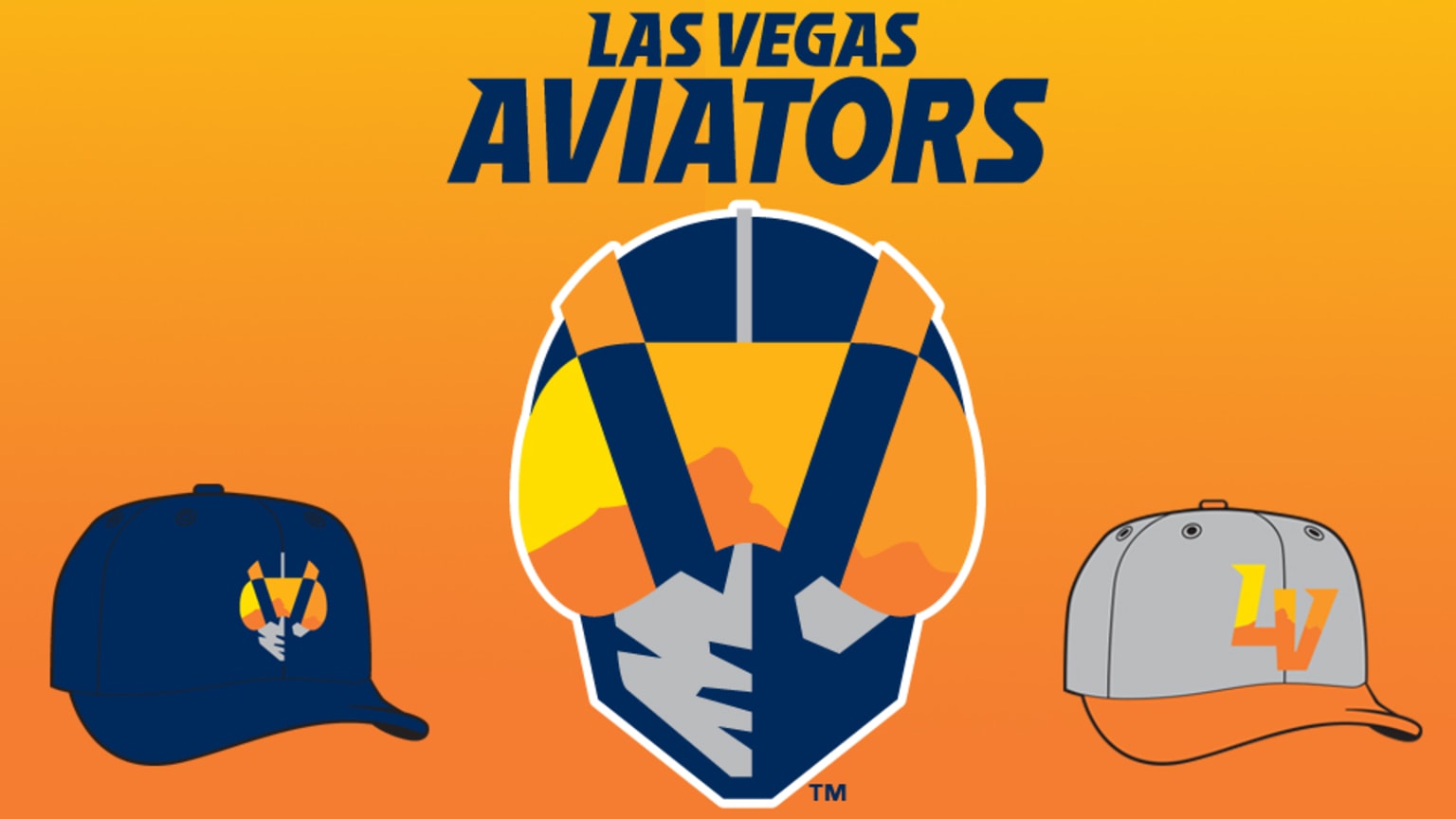
Speaking of reflections from the eyewear of an elevated individual: The Las Vegas Aviators' logo – a tribute to Howard Hughes' aviation legacy – features the Red Rock Canyon Conservation area mountain range reflected in the aviator's sunglasses. These mountains are visible from the team's home of Las Vegas Ballpark. |
Lansing Lugnut (High-A A's)
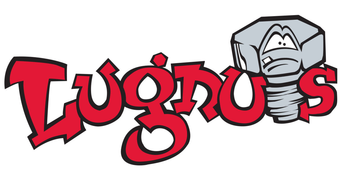
This one's not so much hidden as it is a misdirection. Lansing's legacy of automobile production inspired the Lugnuts' name, which has been in use since the team's 1996 debut. Keep in mind, however, that the anthropomorphic "Lugnut" depicted in the primary logo is not a lug nut. It's a bolt. If you have "hidden" Minor League elements you'd like to suggest for future inclusion in this newsletter, get in touch: benjamin.hill@mlb.com |
NEW ALTERNATE IDENTITIES HIGHLIGHT BREAKFAST AND FOLKLORE |
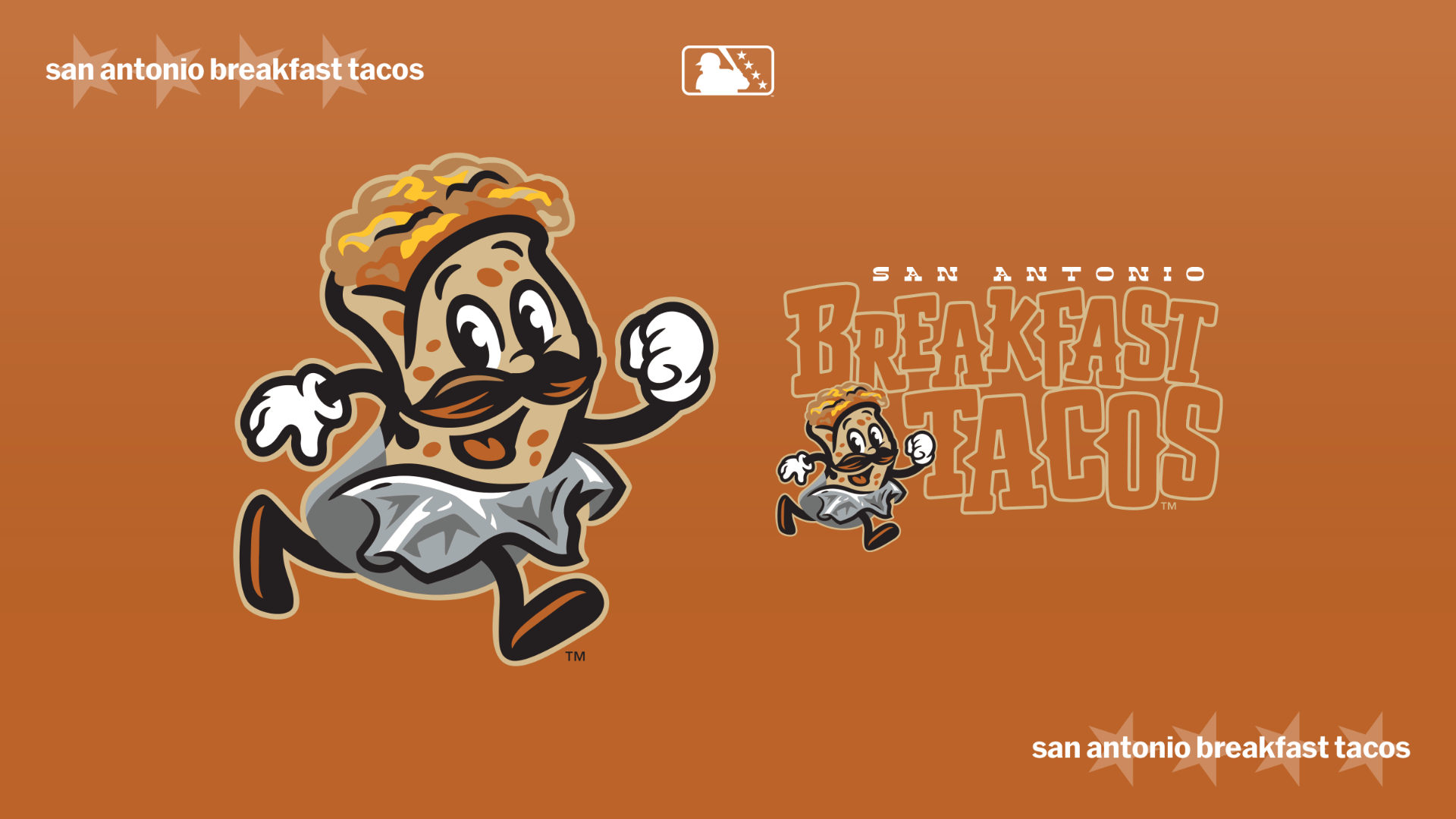
The latest addition to Minor League Baseball's full-to-bursting slate of food-themed alternate identities has arrived. Slot it into the breakfast foods subcategory, most recently dominated by Reading's ongoing series of Morning Game identities (Chipped Beef, Flap Jacks, Iced Coffee). I am speaking, of course, of the San Antonio Breakfast Tacos. The Missions unveiled it earlier this month, remarking that, in San Antonio, "the day's most important meal gets wrapped in a warm, flaky tortilla." |
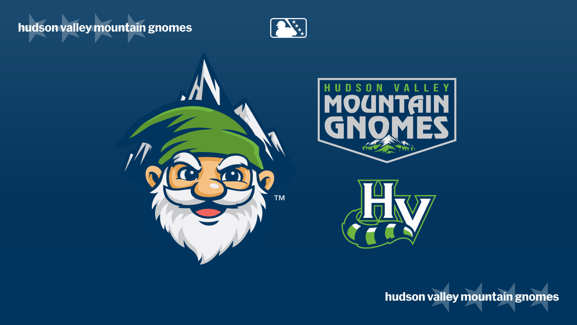
Meanwhile, in Hudson Valley, the Mountain Gnomes have arrived. This new endeavor from the Renegades celebrates an apocryphal tale involving Henry Hudson's encounter with a mysterious group of gnomes in 1609. The Renegades are going all in with this one, offering scented merchandise (what does a gnome smell like?), adding a gnome mascot and, intriguingly, making every jersey unique. The gnome will be in a different location on each one. |
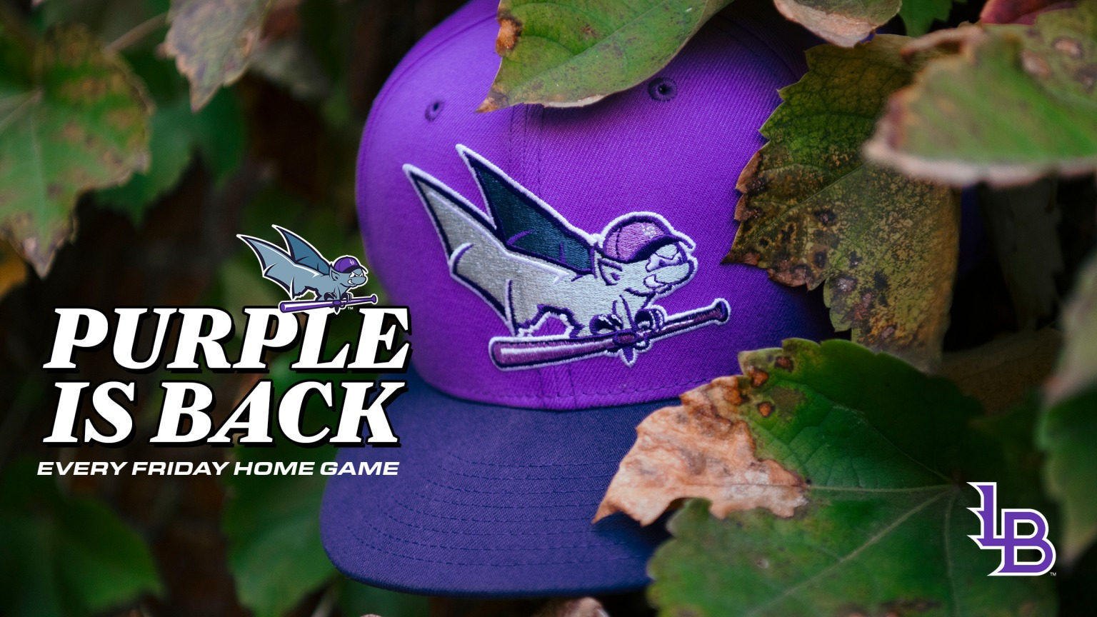
While it's not an alternate identity, I'd like to end this section with some purple prose. The Louisville Bats' new "Derby City" City Connect uniforms, which they will wear every Friday, brings back the color scheme utilized by the team from 1999-2015. |
FROM THE ARCHIVES: TACO TRAUMA TURNS TRIUMPHANT |
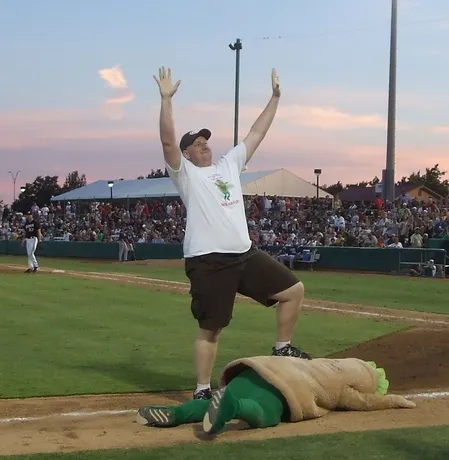
From the archives! The Missions' new San Antonio Breakfast Tacos identity reminded me of a saga I covered back in the “Ben’s Biz Blog” days. Our tale starts in 1992, when 11-year-old Randy Neuenfeldt was a contestant in the Missions' nightly Puffy Taco Race. His task was to beat Henry the Puffy Taco in a race around the basepaths, a seemingly easy task given that Henry had never won a race. But on this night, things went differently. "As I went around third, the taco was ahead of me," explained Neuenfeldt. "He was goofing around, doing a dance, and he ended up going a little too far and touched home plate ahead of me. The PA guy saw that and ran with it: 'Ladies and gentleman, you've just witnessed history! For the first time ever the Puffy Taco has won a race!' Everybody was booing, and I thought they were booing me for losing the race. I was crying as they brought me off of the field." In 2010, a Missions staffer who still felt guilty about this travesty tracked Neuenfeldt down and offered him a Puffy Taco Race rematch. Over 100 friends and family members came out to cheer him on as he finally exorcised his childhood trauma. |
"It was great to have my shot at redemption, and now there's a sense of closure," said Neuenfeldt. |
SPEAKING OF CLOSURE, THIS NEWSLETTER IS COMPLETE |
|
|
|
© 2026 MLB Advanced Media, L.P. MLB trademarks and copyrights are used with permission of Major League Baseball. Visit MLB.com. Any other marks used herein are trademarks of their respective owners.
Please review our Privacy Policy.
You (josh.jackson@mlb.com) received this message because you registered to receive commercial email messages or purchased a ticket from MLB.
Please add info@marketing.mlbemail.com to your address book to ensure our messages reach your inbox. If you no longer wish to receive commercial email messages from MLB.com, please unsubscribe or log in and manage your email subscriptions.
Postal Address: MLB.com, c/o MLB Advanced Media, L.P., 1271 Avenue of the Americas, New York, NY 10020.
|
|
|
|
|